Although I'm not a full-time user experience designer, I care strongly about UX. When I come across UX issues in the projects I work on, I do my best to correct them. Below are a few examples.
The Case of the Wrong Audience
I received a comp from the design team for a page listing online training classes for new clients. It looked this:
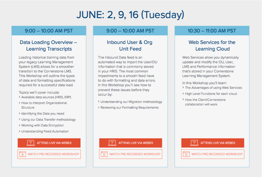
Instead of diving right into coding, I took a step back and thought about the intended audience, human resources administrators trying to learn our software. These HR admins care more about what they're learning than about the time the course is being taught.
I suggested the below information architecture, which de-empahsized the date and time of the course offerings, making the course content much easier to visually scan.
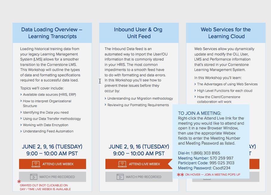
I also recommended other UX improvements, such as moving the instructions for attending the webinar from the bottom of the page to a popup triggered by hovering over the "Attend Live Webex" button.
The Case of Unscannable Content
The below web page lists all its information resources in a randomized tile format. These include several different types of resources (webinars, infographics, briefs, etc.).
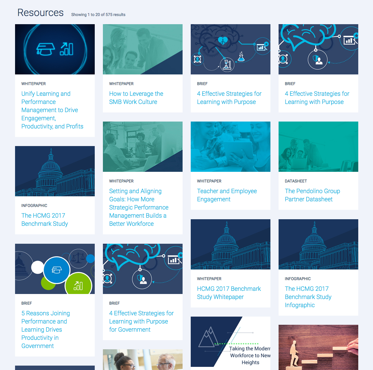
I felt that the information cards on the page were hard to scan. The only way for the user to make sense of the cards was to locate the card type filter dropdown at the top of the page (not shown).
I proposed the below restructuring concept to increase scannability of the page and decrease the number of steps a user would have to take to make sense of the content:
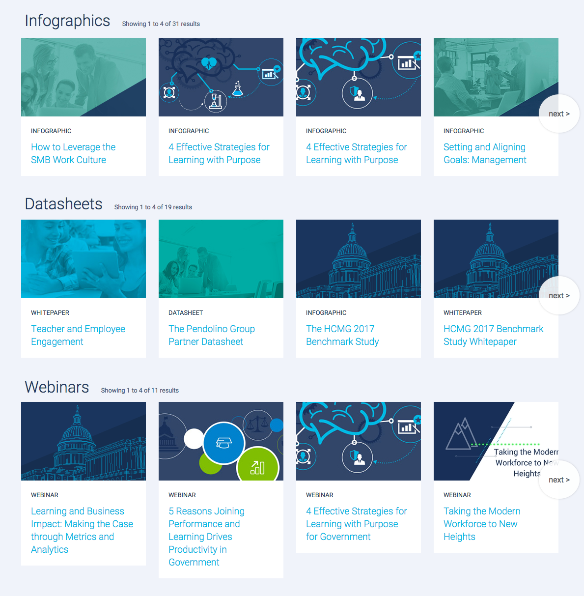
This format also makes it easier for the user to re-browse to the same piece of content, and to easily tell if new content of a particular type has been added.