BrightfieldRedesign
The Project#
Brightfield is my generative art studio, where WebGL shaders become shirts you can wear. In fall 2026 I redesigned its homepage in Figma around three things: the art, the person making it, and a tool that lets visitors make their own.
I own the brand, the design, and the build. Below is why I redesigned it, the old page next to the new one, the decisions behind three parts of it, and the variables it's built from. For the story of the studio itself, see Work I've Done.
View in FigmaWhy Redesign?#
The old Brightfield worked. You could pick a design, change it, and buy a shirt. But the homepage led with how the shirts are made. The headline was “Source Code for Your Shirt”, and a visitor had to decipher the technology before they understood the product.
I wanted the order reversed. Brightfield should read first as an art and design studio with a person behind it, not as a print-on-demand store or a tech demo. The code is still the reason the art exists, but it should come in after the art has earned your attention.
I wrote myself a brief built around one question: how do you make generative art something people want to wear, and make designing your own feel easy? Three goals came out of it. Give Brightfield a clear identity. Give buying a design and making one equal weight on the homepage. And make the shader controls work for someone who has never heard of a shader.
Before and After#
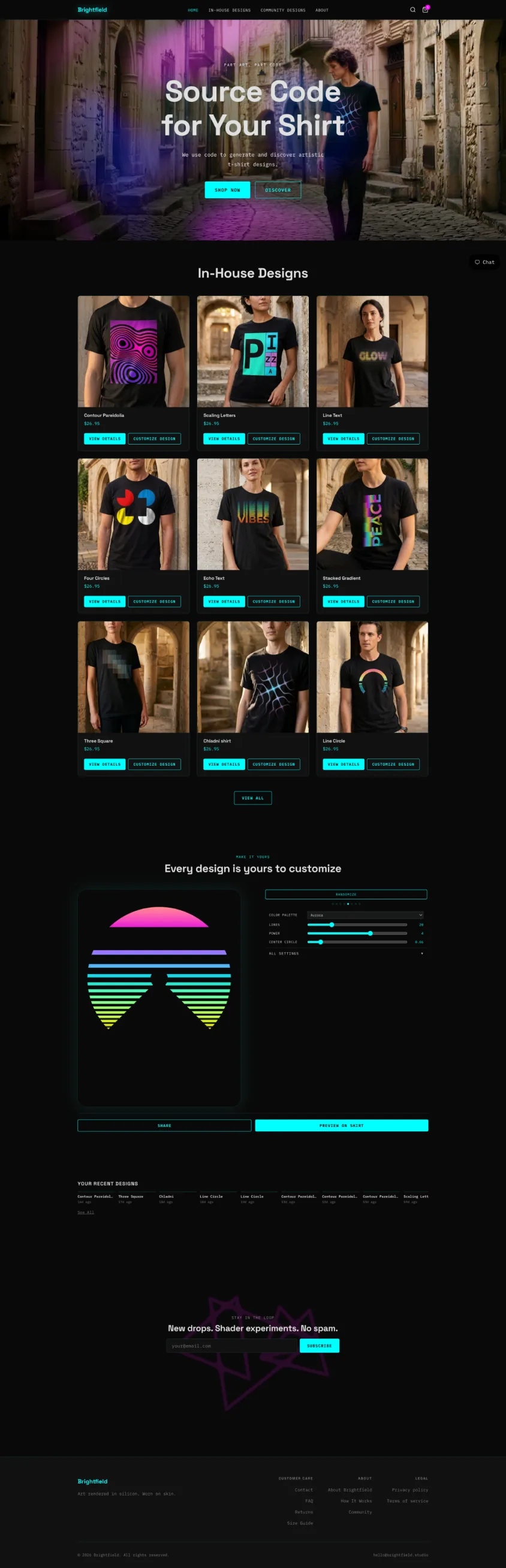
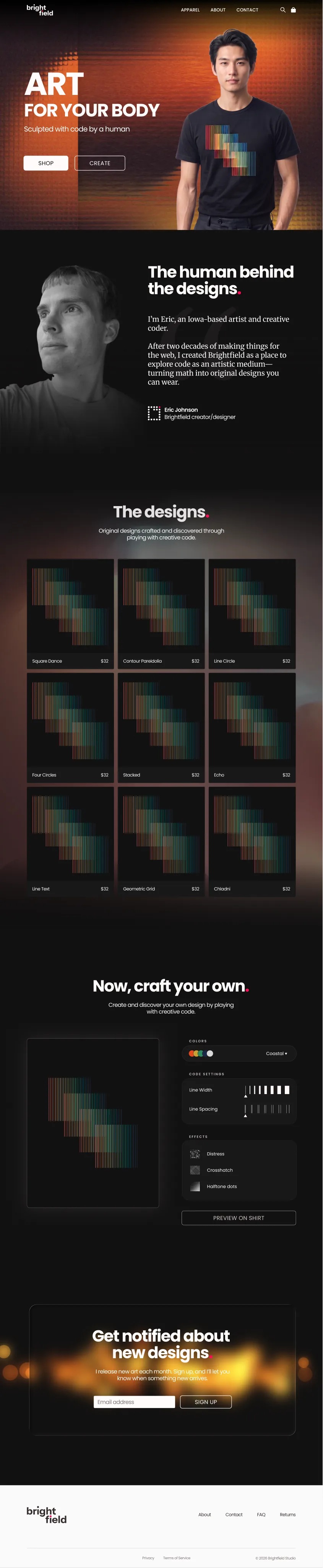
Here is the homepage I started from, next to the redesign. The old one isn't bad. It has a clear grid, a working customizer, and a look of its own. But it talks about code before it talks about art.
Before
After
What's the same
- The dark page.
- The order: shop first, then make your own, then sign up.
- Nine designs in a three-by-three grid.
- The canvas on the left with controls on the right, ending in Preview on shirt.
- Two buttons in the hero, one for each thing you can do.
What changed
- The headline went from “Source Code for Your Shirt” to “Art for your body”.
- The hero went from a model photo with a shader laid over it to the art edge to edge, with a model wearing one of the designs in front of it.
- Neon cyan and magenta with monospace labels became warm neutrals, one pink accent, and Poppins.
- A new section introduces the person making the art.
- Product cards went from a model photo with two buttons to the art, a name, and a price.
- The customizer went from a dropdown and numbered sliders (Lines, Power, Center Circle) to a palette, two visual sliders, and three effects.
- The navigation dropped Community Designs and went from four links to three.
The Hero#
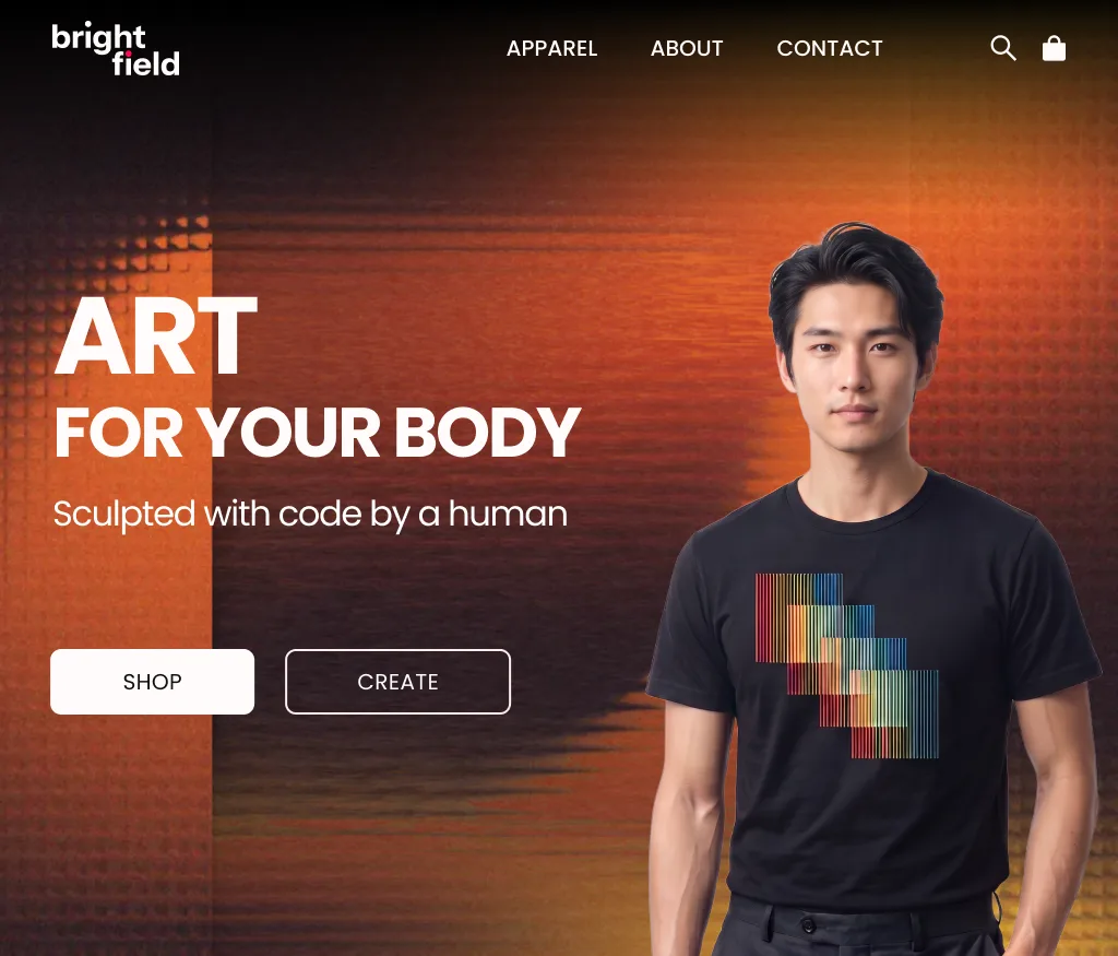
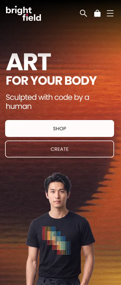
The art fills the first screen, edge to edge, and a model wears one of the designs, so the first thing you see is the art as a shirt. The headline is three words, and the two buttons name the two things you can do at Brightfield: shop a design, or create one.
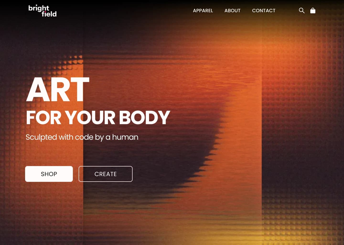
I tried the headline three ways before the image changed at all: light lowercase, light uppercase, and bold uppercase with a quieter line under it.
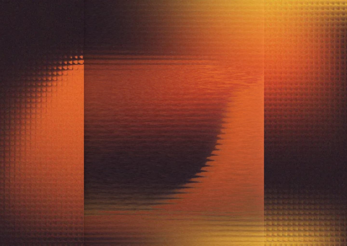
Then the image. I mocked up a photo of a man in a shop, like the photo-led hero on the old homepage, and a plain gradient, before settling on the orange render. The final design puts a model wearing one of the printed shirts in front of that render, so the art and the shirt arrive together.
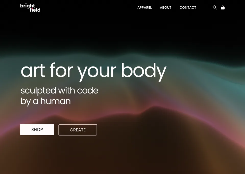
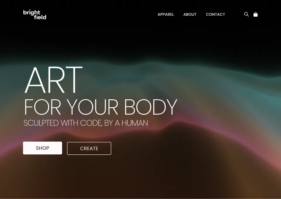
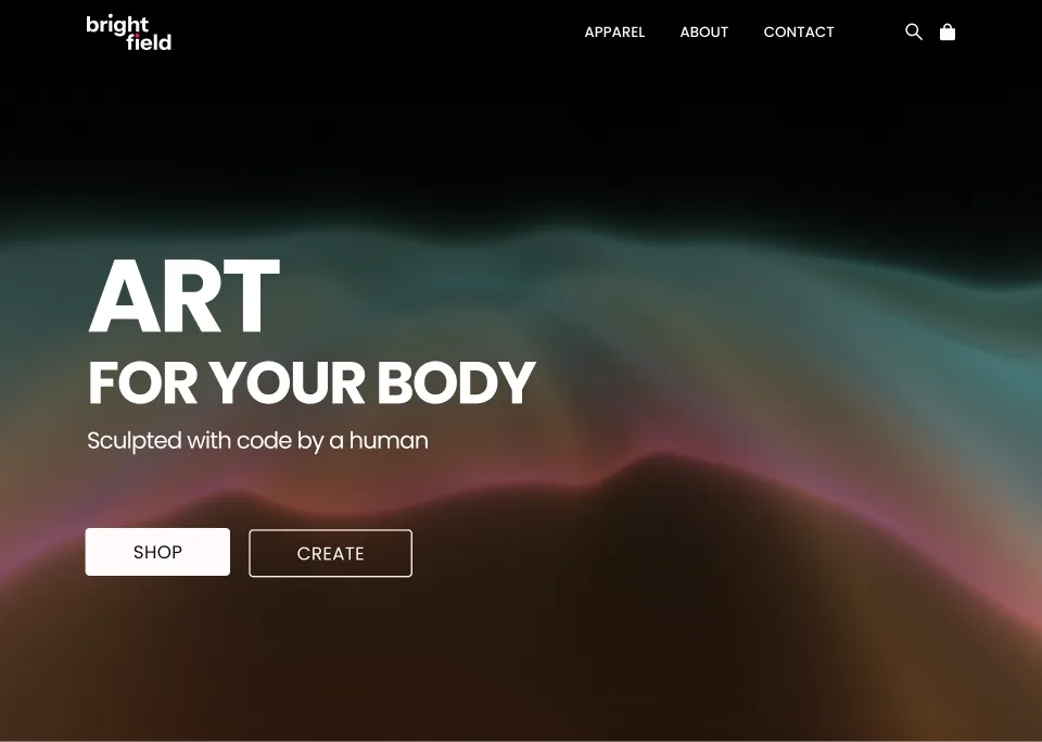
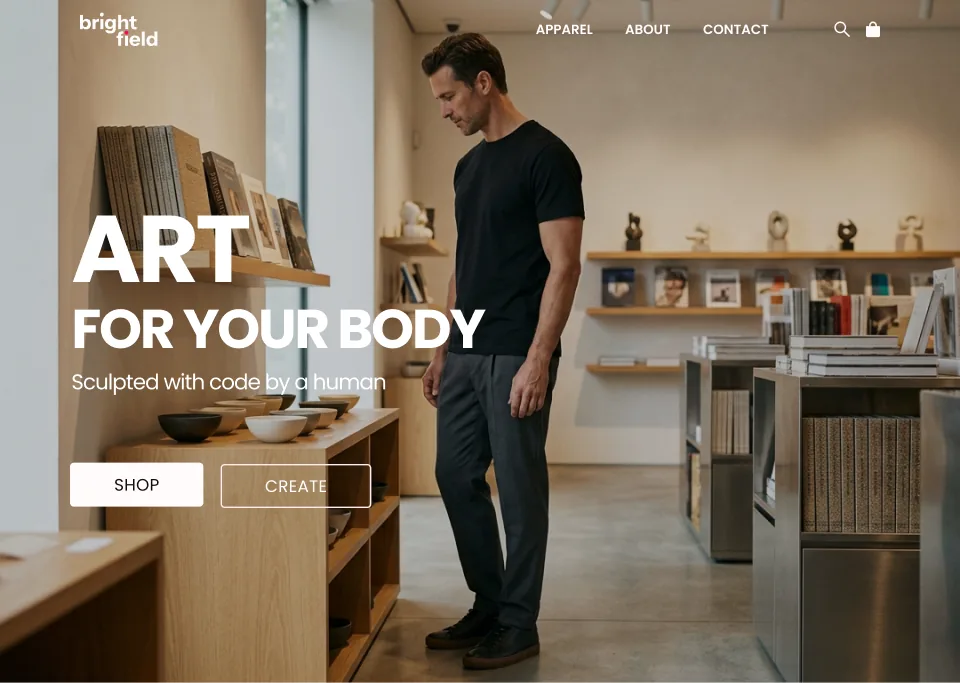
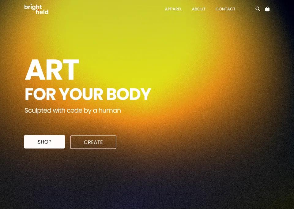
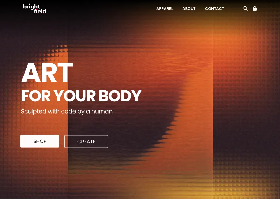
The first line I wrote was “Art crafted with code (by a human)”. It became “Art for your body” with “Sculpted with code by a human” beneath it, so the code moves to the second line and the wearing moves to the first.
The Human#
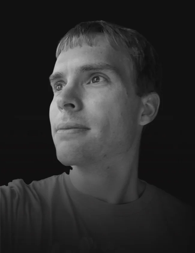
I want people to know each design is made by a person, so the second section shows that person: a face and a short bio. It is the one place on the page set in Merriweather, so it reads like a person talking and not like interface.
The human behind the designs.
I’m Eric, an Iowa-based artist and creative coder.
After two decades of making things for the web, I created Brightfield as a place to explore code as an artistic medium—turning math into original designs you can wear.

I laid this section out four ways with the same words. The first three set the bio as a quote, with a heading, a large quotation mark, and a small round avatar. The fourth gives a black and white portrait half the section. The final version keeps that portrait, moves it to the left, and puts the large quotation mark back behind the bio. The avatar is gone, and the Brightfield lettermark sits in its place next to my name.
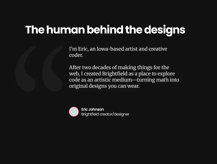
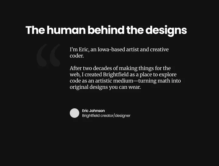
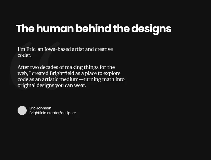
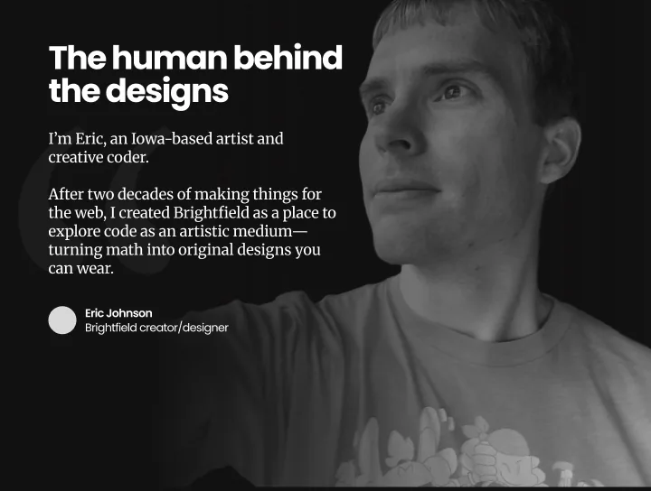
The words changed too. My outline called this “The human behind the code”. It became “The human behind the designs”. The bio also got shorter: “turning math, color, and motion into original designs” became “turning math into original designs”.
The Designs#
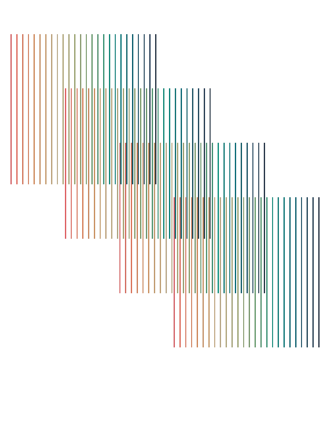
I wanted the experience to feel spare, more like an art museum than a traditional online store. The art fills the card, and the name and price sit in one thin bar at the bottom.
The designs.
Original designs crafted and discovered through playing with creative code.
The Tool#
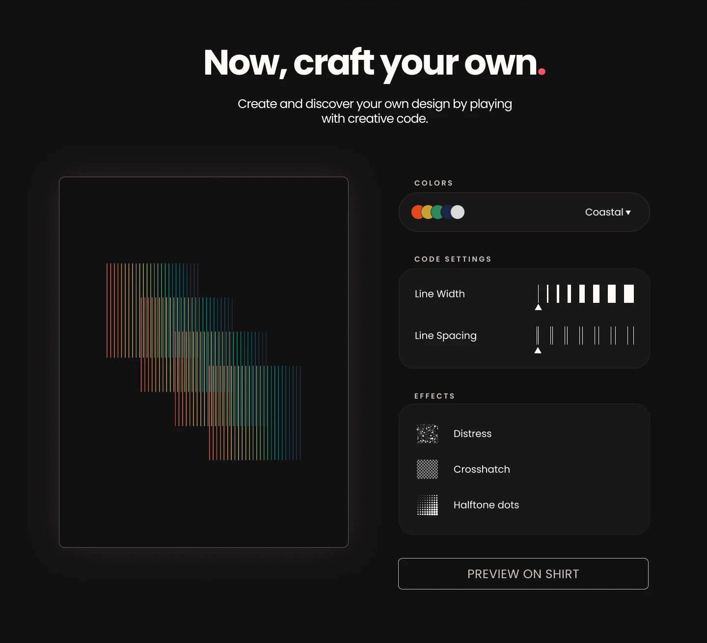
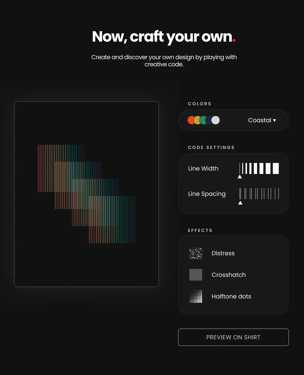
After the in-house designs comes the invitation to make your own. The controls are the parameters of the code itself: a palette, line width, line spacing, and three print effects.
The Sign-Up#
New art arrives monthly, so the page ends with one field and one button, then a footer that stays out of the way.
Get notified about
new designs.
I release new art each month. Sign up, and I’ll let you know when something new arrives.

Tablet and Mobile#
The page is designed at three widths: 1440 for desktop, 1024 for tablet, and 402 for mobile. On tablet the layout keeps its desktop shape at a smaller size. On mobile the navigation shrinks to search, bag, and a menu, and the Shop and Create buttons stack full width so both stay easy to tap.
The shader controls change the most. On tablet the canvas stays in view beside the controls as you scroll through them.
Mobile Shader Controls#
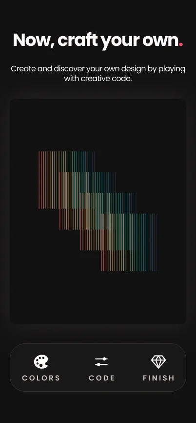
On desktop the canvas and the three control panels sit side by side. On a phone there isn't room, and stacking them would mean scrolling away from the art to change it, then scrolling back to see what happened. My brief had a line for this: keep the artwork visible while the shopper experiments.
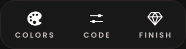
So on mobile the controls are a bar over the bottom of the canvas, with three tabs: Colors, Code, and Finish. Tap one and a single row opens above it. The canvas never leaves the screen.
 Closed
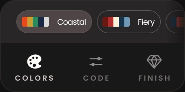 Colors
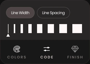 Code
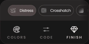 Finish
Each drawer holds one row and no more. Colors is a strip of named palettes you swipe through. Code has two settings, Line Width and Line Spacing, and you switch between them with a toggle so only one slider shows at a time. Finish is three effects.
The sliders have no numbers. The old customizer had sliders named Lines, Power, and Center Circle, with numeric values beside them. The new slider for line width is drawn as a row of bars getting wider, and the one for spacing as lines moving apart, so the control shows you what it does before you touch it.
The Wordmark#
The final wordmark stacks “bright” over “field” in lowercase, with the dot on the i in pink. Alongside it is a lettermark built from a frame of dots, drawn in three versions: pink dots around a b, white dots with a single pink corner, and a b with dots fading from white to grey.




The System#
Every value on the page is a Figma variable, named the way it will be named in CSS. Two typefaces, nine spacing steps, five radii, and a neutral ramp that leans slightly red all the way down, so that even the black sits comfortably next to the pink.
Color
- color-bg-page#121111
- color-bg-surface#191818
- color-neutral-10#1e1b1b
- color-border-default#372e2e
- color-border-strong#665c5c
- color-neutral-50#7f7575
- color-text-secondary#cfc4c4
- color-neutral-99#fffbfb
- color-pink-54#ff0a54
- color-text-brand#ff516a
Type
- ART FOR YOUR BODYH1, Poppins Bold 80 / 96
- The designsH2, Bold 72 / 74
- Sculpted with code by a humanLead, Regular 32 / 40
- Turning math into original designsQuote, Merriweather 32 / 40
- Create and discover your own designBody, Regular 25 / 30
- Contour PareidoliaSmall, Regular 20 / 24
- CODE SETTINGSOverline, SemiBold 15, +22%
Spacing
- 3xs 2
- 2xs 4
- xs 8
- sm 12
- md 16
- lg 24
- xl 32
- 2xl 48
- 3xl 64
Radius
- sm 4
- md 8
- lg 12
- xl 32
- full 999
The File#
Everything above comes from one Figma file, with a frame for each of desktop, tablet, and mobile. Here it is, with the variables and components intact. You can also open it in Figma.
Opens Figma's viewer here. Pan and zoom to explore.
Reflection#
This redesign isn't live yet, so there are no numbers to show.
The biggest surprise was how much clearer the shader controls became once I designed them instead of using default sliders. The difference was obvious even to me, and I wrote the shaders. It's the part I'm happiest with: controls that show what they change and make it easy for you to try them.